Poll
(http://i.imgur.com/MgOyk.png) (http://i.imgur.com/Mr9au.png)
gz gz gz :D
:D RED ! FTW !
nice but dont make it CIRCLE make it SQUARE pls :D
How wide?
about 1/2 more wider :D
Errr. No it isnt. I got all photos from google and I used photos from google and then I used adobe photoshop elements 10.0 to crop the photos. Give them effects and put layered text on. I dont even know what bannermaker.com or whatever it is...
Thx $nakie,Vette,Geckco and Deff =P i Put a Bit of Effort on It since i tooke an Hour to Make it :P
CS4 BTW. Also. Anyone else's logo or banners are nice imo :P
Helion. Do you mind telling me how I do that? Its soo cool. Is there like a program or a website or do you just do it on a normal photoshop program..?
It looks like the GTA4 font layered with a B&W photo of a truck, which looks EPIC as I've said.
Nice and simple. Like it.
2nd: added :)
I would like to vote for this one as a write in..
snake, both of nitrochegs pic are the same.. I would suggest changing #2 to this one
and since new year we will start using new CT Logo :)
I think there's a flaw in this strategy, because if they are so similar, a lot of people who like them all can vote only 1 and the votes will be evenly distributed across his works and as a result no single logo will have more votes than others.
Same goes for other submission that were divided into multiple entries.
It would be more fair if only one of his works was subject to voting.
since 21st will be 10-days voting where will be only best logos, not the packs of best logos..
:seriously_guy:
I'm referrign to the current poll where you CAN see the names.
its nothing like new player or player who has history. Doesnt matter to me.
I was just wondering if votes could be edited before the closing. Its very hard to vote on them to be honest. All look good. (no offense, nor this a diplomatic move)
And I completely agree with mick88 for merging the votes of similar images.
Because merging those votes to one, would mean all those who voted for white background are satisfied with transparent background as well because they are similar images. Whereas for example, image 1 (of $nake) is selected, whereas people who voted for neonslash would not be satisfied with it. So we should see where the majority lies.
Hence, those all votes of similar images should be merged to one.
Question: which of these should be Official Convoy Trucking Logo ?
Option 1:  $nake's one
votes: 9
$nake's one
votes: 9
$nake's one
votes: 9
Option 2:  Ovel_ha[BRA]'s #1
votes: 0
Ovel_ha[BRA]'s #1
votes: 0
Ovel_ha[BRA]'s #1
votes: 0
Option 3:  Ovel_ha[BRA]'s #2
votes: 0
Ovel_ha[BRA]'s #2
votes: 0
Ovel_ha[BRA]'s #2
votes: 0
Option 4: 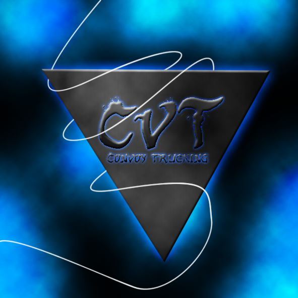 badboi787[Epic]'s #1
votes: 4
badboi787[Epic]'s #1
votes: 4
Option 5:  Neon$lash's one
votes: 12
Neon$lash's one
votes: 12
Neon$lash's one
votes: 12
Option 6:  badboi787[Epic]'s #2
votes: 0
badboi787[Epic]'s #2
votes: 0
badboi787[Epic]'s #2
votes: 0
Option 7:  BlueShadow[AUS]'s #1
votes: 1
BlueShadow[AUS]'s #1
votes: 1
BlueShadow[AUS]'s #1
votes: 1
Option 8:  BlueShadow[AUS]'s #2
votes: 0
BlueShadow[AUS]'s #2
votes: 0
BlueShadow[AUS]'s #2
votes: 0
Option 9:  BlueShadow[AUS]'s #3
votes: 1
BlueShadow[AUS]'s #3
votes: 1
BlueShadow[AUS]'s #3
votes: 1
Option 10:  BlueShadow[AUS]'s #4
votes: 1
BlueShadow[AUS]'s #4
votes: 1
BlueShadow[AUS]'s #4
votes: 1
Option 11:  BlueShadow[AUS]'s #5
votes: 3
BlueShadow[AUS]'s #5
votes: 3
BlueShadow[AUS]'s #5
votes: 3
Option 12:  Bob_Ferret[AUS]'s one
votes: 8
Bob_Ferret[AUS]'s one
votes: 8
Bob_Ferret[AUS]'s one
votes: 8
Option 13:  twizeler's one
votes: 2
twizeler's one
votes: 2
twizeler's one
votes: 2
Option 14:  KiwiTrucker[NZ]'s one
votes: 2
KiwiTrucker[NZ]'s one
votes: 2
KiwiTrucker[NZ]'s one
votes: 2
Option 15:  BobWho's one
votes: 3
BobWho's one
votes: 3
BobWho's one
votes: 3
Option 16:  HeLiOn_PrImE's #1
votes: 2
HeLiOn_PrImE's #1
votes: 2
HeLiOn_PrImE's #1
votes: 2
Option 17:  Nitrochegs's #1 (with white bg)
votes: 4
Nitrochegs's #1 (with white bg)
votes: 4
Nitrochegs's #1 (with white bg)
votes: 4
Option 18:  Nitrochegs's #2 (with transparent bg)
votes: 9
Nitrochegs's #2 (with transparent bg)
votes: 9
Nitrochegs's #2 (with transparent bg)
votes: 9
Option 19:  HeLiOn_PrImE's #2
votes: 12
HeLiOn_PrImE's #2
votes: 12
HeLiOn_PrImE's #2
votes: 12
Option 20:  Nitrochegs's #3 (with transparent bg)
votes: 10
Nitrochegs's #3 (with transparent bg)
votes: 10
Nitrochegs's #3 (with transparent bg)
votes: 10
Title: Official Convoy Trucking logo
Post by: $nake on November 12, 2011, 20:33
Post by: $nake on November 12, 2011, 20:33
i wanna announce a contest for all who can use Photoshop or logo makers
to make a cool (no matter what size, but not so tiny) Convoy Trucking Logo.
the best one can be chosen in voting, like clubs' signatures
it would be cool to see this same official CT logo in every community
like xfire, facebook, twitter, steam, etc.. so.. best logo makers get to work :)
(remember that logo IS NOT a signature/banner - its more square and bigger)
Title: Re: Official Convoy Trucking logo
Post by: martata14 on November 12, 2011, 20:43
Post by: martata14 on November 12, 2011, 20:43
nice idea :)
Title: Re: Official Convoy Trucking logo
Post by: Ethan on November 12, 2011, 20:46
Post by: Ethan on November 12, 2011, 20:46
something other than this??:
(http://www.image-share.com/upload/1052/166.png) (http://www.image-share.com/ipng-1052-166.html)
(http://www.image-share.com/upload/1052/166.png) (http://www.image-share.com/ipng-1052-166.html)
Title: Re: Official Convoy Trucking logo
Post by: $nake on November 12, 2011, 21:04
Post by: $nake on November 12, 2011, 21:04
Quote from: Ethan on November 12, 2011, 20:46nope.. i will show an exampe of simpe logos :)
something other than this??:
(http://www.image-share.com/upload/1052/166.png) (http://www.image-share.com/ipng-1052-166.html)
(http://i.imgur.com/MgOyk.png) (http://i.imgur.com/Mr9au.png)
Title: Re: Official Convoy Trucking logo
Post by: Anri on November 13, 2011, 09:58
Post by: Anri on November 13, 2011, 09:58
pls make a wide one so me or ethan can add it into artic trailer 1 :D
Title: Re: Official Convoy Trucking logo
Post by: $nake on November 13, 2011, 11:12
Post by: $nake on November 13, 2011, 11:12
Quote from: Albanian_Style on November 13, 2011, 09:58banner would be needed too, but logo is more important :P
pls make a wide one so me or ethan can add it into artic trailer 1 :D
Title: Re: Official Convoy Trucking logo
Post by: DeHavilland on November 13, 2011, 11:28
Post by: DeHavilland on November 13, 2011, 11:28
Nice logos! (http://i.imgur.com/4fIXA.gif)
btw my 1000th post! :)
btw my 1000th post! :)
Title: Re: Official Convoy Trucking logo
Post by: $nake on November 13, 2011, 11:38
Post by: $nake on November 13, 2011, 11:38
Quote from: DeHavilland on November 13, 2011, 11:28where ? :o i wanna sb to make one :D
Nice logos! (http://i.imgur.com/4fIXA.gif)
btw my 1000th post! :)
gz gz gz :D
Title: Re: Official Convoy Trucking logo
Post by: mrtrlt on November 13, 2011, 12:03
Post by: mrtrlt on November 13, 2011, 12:03
Okay. Tomorow after school ill give this a go. Im using Adobe Photoshop Elements 10.0
Ps: can you leave auditions open all week. I wanna spend good time on this to make it good.
Ill try my best :)
Ps: can you leave auditions open all week. I wanna spend good time on this to make it good.
Ill try my best :)
Title: Re: Official Convoy Trucking logo
Post by: Deff on November 13, 2011, 17:44
Post by: Deff on November 13, 2011, 17:44
maybe a 2 trucks in the opposite direction and "Convoy Trucking" text in the center, this all can be done on a Large truck wheel background.
Maybe that will look good.
Maybe that will look good.
Title: Re: Official Convoy Trucking logo
Post by: Konali on November 13, 2011, 17:53
Post by: Konali on November 13, 2011, 17:53
Best logo would be when all trucks are pink :) :so_much_win:
Title: Re: Official Convoy Trucking logo
Post by: Anri on November 13, 2011, 18:00
Post by: Anri on November 13, 2011, 18:00
Quote from: Konali on November 13, 2011, 17:53
Best logo would be when all trucks are pink :) :so_much_win:
:D RED ! FTW !
Title: Re: Official Convoy Trucking logo
Post by: badboi787 on November 13, 2011, 18:22
Post by: badboi787 on November 13, 2011, 18:22
I'm making one right now. :)
Title: Re: Official Convoy Trucking logo
Post by: Gabriel Klock on November 13, 2011, 19:23
Post by: Gabriel Klock on November 13, 2011, 19:23
i did 2 simple ones in 5 min. (big version, must resize)
look here:
http://i.imgur.com/GcQ93.jpg
http://i.imgur.com/M2bRk.jpg
i can do better. :D
Hope you like it :P
look here:
http://i.imgur.com/GcQ93.jpg
http://i.imgur.com/M2bRk.jpg
i can do better. :D
Hope you like it :P
Title: Re: Official Convoy Trucking logo
Post by: Anri on November 13, 2011, 19:31
Post by: Anri on November 13, 2011, 19:31
Quote from: Gabriel Klock on November 13, 2011, 19:23
i did 2 simple ones in 5 min. (big version, must resize)
look here:
http://i.imgur.com/GcQ93.jpg (http://i.imgur.com/GcQ93.jpg)
http://i.imgur.com/M2bRk.jpg (http://i.imgur.com/M2bRk.jpg)
i can do better. :D
Hope you like it :P
nice but dont make it CIRCLE make it SQUARE pls :D
Title: Re: Official Convoy Trucking logo
Post by: badboi787 on November 13, 2011, 19:33
Post by: badboi787 on November 13, 2011, 19:33
Done!
(http://fc04.deviantart.net/fs71/f/2011/317/7/b/convoy_trucking_logo_by_badboi787-d4g2hj1.png)
Download link: http://www.mediafire.com/?tdbuz911unfr64u
(http://fc04.deviantart.net/fs71/f/2011/317/7/b/convoy_trucking_logo_by_badboi787-d4g2hj1.png)
Code Select
[img]http://fc04.deviantart.net/fs71/f/2011/317/7/b/convoy_trucking_logo_by_badboi787-d4g2hj1.png[/img]Download link: http://www.mediafire.com/?tdbuz911unfr64u
Title: Re: Official Convoy Trucking logo
Post by: Anri on November 13, 2011, 19:49
Post by: Anri on November 13, 2011, 19:49
can u make a wide version pls
Title: Re: Official Convoy Trucking logo
Post by: badboi787 on November 13, 2011, 19:52
Post by: badboi787 on November 13, 2011, 19:52
Quote from: Albanian_Style on November 13, 2011, 19:49
can u make a wide version pls
How wide?
Title: Re: Official Convoy Trucking logo
Post by: Anri on November 13, 2011, 20:24
Post by: Anri on November 13, 2011, 20:24
Quote from: badboi787 on November 13, 2011, 19:52Quote from: Albanian_Style on November 13, 2011, 19:49
can u make a wide version pls
How wide?
about 1/2 more wider :D
Title: Re: Official Convoy Trucking logo
Post by: Neon$lash on November 13, 2011, 20:44
Post by: Neon$lash on November 13, 2011, 20:44
Took some time to Make It. Its Tiny. But if you guys Liked it a Bit i would make it bigger :)
(http://i.imgur.com/QBVGm.png)
(http://i.imgur.com/QBVGm.png)
Title: Re: Official Convoy Trucking logo
Post by: Corvette on November 13, 2011, 20:54
Post by: Corvette on November 13, 2011, 20:54
+1 neons :)
Title: Re: Official Convoy Trucking logo
Post by: badboi787 on November 13, 2011, 20:59
Post by: badboi787 on November 13, 2011, 20:59
(http://i.imgur.com/Y6pNv.png)
http://www.mediafire.com/?dn9tadevc76gl5z
Around 1/2 wider and the text "Convoy trucking" bigger like you said. :)
http://www.mediafire.com/?dn9tadevc76gl5z
Around 1/2 wider and the text "Convoy trucking" bigger like you said. :)
Title: Re: Official Convoy Trucking logo
Post by: Gabriel Klock on November 13, 2011, 21:56
Post by: Gabriel Klock on November 13, 2011, 21:56
Nice guys! :P
would be cool add Neon logo into badboy logo, beneath the CVT
would be cool add Neon logo into badboy logo, beneath the CVT
Title: Re: Official Convoy Trucking logo
Post by: Geckco on November 13, 2011, 22:49
Post by: Geckco on November 13, 2011, 22:49
I like neon's. i give it a big fat +1
Title: Re: Official Convoy Trucking logo
Post by: mrtrlt on November 13, 2011, 23:07
Post by: mrtrlt on November 13, 2011, 23:07
I like yours a lot badboi. But it looks like it belongs to a completely different game. There arnt any trucks involved. Looks like its from harry potter or somethin rofl.
Title: Re: Official Convoy Trucking logo
Post by: $nake on November 14, 2011, 09:36
Post by: $nake on November 14, 2011, 09:36
neonie's is cool :D badie should add sth more with truck accent :)
make sth like neonie, maybe try circle, square, triangle, not this big with background :D
make sth like neonie, maybe try circle, square, triangle, not this big with background :D
Title: Re: Official Convoy Trucking logo
Post by: mrtrlt on November 14, 2011, 10:47
Post by: mrtrlt on November 14, 2011, 10:47
Okay, these are the finished products. I know i know.. theyre not that impressive as I had a limited time to spend on them because of exam study ect...
if you guys have any ideas for changes just tell me and ill give them a go as soon as I have time
Here is the album:
Convoy Trucking Signature Album (http://imgur.com/a/SwJmq)
The Individual Pics:
(http://i.imgur.com/2V1U5m.jpg)
(http://i.imgur.com/F1tqRm.jpg)
(http://i.imgur.com/RAiUbm.jpg)
(http://i.imgur.com/HJYqMm.jpg)
(http://i.imgur.com/FLz4Km.jpg)
I used only Scania coz they're best and I used Photoshop elements 10.0 Effects with some of them
PS: My copywrite...
:suspicious:
Hope ya like :)
if you guys have any ideas for changes just tell me and ill give them a go as soon as I have time
Here is the album:
Convoy Trucking Signature Album (http://imgur.com/a/SwJmq)
The Individual Pics:
(http://i.imgur.com/2V1U5m.jpg)
Code Select
[IMG]http://i.imgur.com/2V1U5.jpg[/IMG](http://i.imgur.com/F1tqRm.jpg)
Code Select
[IMG]http://i.imgur.com/F1tqRs.jpg[/IMG](http://i.imgur.com/RAiUbm.jpg)
Code Select
[IMG]http://i.imgur.com/RAiUb.jpg[/IMG](http://i.imgur.com/HJYqMm.jpg)
Code Select
[IMG]http://i.imgur.com/HJYqM.jpg[/IMG](http://i.imgur.com/FLz4Km.jpg)
Code Select
[IMG]http://i.imgur.com/FLz4K.jpg[/IMG]I used only Scania coz they're best and I used Photoshop elements 10.0 Effects with some of them
PS: My copywrite...
:suspicious:
Hope ya like :)
Title: Re: Official Convoy Trucking logo
Post by: Gabriel Klock on November 14, 2011, 11:33
Post by: Gabriel Klock on November 14, 2011, 11:33
nice i liked all but the last is the best :P
Title: Re: Official Convoy Trucking logo
Post by: Bob_Ferret on November 14, 2011, 13:47
Post by: Bob_Ferret on November 14, 2011, 13:47
Hey all!
This is a quick one I did before going to bed. :P
(http://img846.imageshack.us/img846/2467/cvt.png)
This is a quick one I did before going to bed. :P
(http://img846.imageshack.us/img846/2467/cvt.png)
Title: Re: Official Convoy Trucking logo
Post by: Gabriel Klock on November 14, 2011, 14:18
Post by: Gabriel Klock on November 14, 2011, 14:18
Nice one :P
Title: Re: Official Convoy Trucking logo
Post by: Deff on November 14, 2011, 15:42
Post by: Deff on November 14, 2011, 15:42
+1 for neon_slash
Title: Re: Official Convoy Trucking logo
Post by: badboi787 on November 14, 2011, 16:16
Post by: badboi787 on November 14, 2011, 16:16
Matt your ones look good. :D
Title: Re: Official Convoy Trucking logo
Post by: Twizeler on November 14, 2011, 16:43
Post by: Twizeler on November 14, 2011, 16:43
(http://i1117.photobucket.com/albums/k593/twizeler/ConvoyTruckinglogo.jpg)
hope you like it :)
(i dont think you like it :P)
hope you like it :)
(i dont think you like it :P)
Title: Re: Official Convoy Trucking logo
Post by: Anri on November 14, 2011, 17:17
Post by: Anri on November 14, 2011, 17:17
cooool and very original TWIZ ! nice work dude
Title: Re: Official Convoy Trucking logo
Post by: $nake on November 14, 2011, 19:58
Post by: $nake on November 14, 2011, 19:58
1. neonie's still wins for me as logo
2. bob's if will be more tuned, and more detailed, can be as big signature
3. twi's if will be fixed a little by our experts (like badie), will be official signature
(this image can be used with better - more cool/tuned text font etc etc)
4. bluie's looks too much like just photo, ofc can be tuned, and we will see :)
Title: Re: Official Convoy Trucking logo
Post by: Twizeler on November 14, 2011, 20:06
Post by: Twizeler on November 14, 2011, 20:06
Quote from: $nake on November 14, 2011, 19:58i do it myself first :P
3. twi's if will be fixed a little by our experts (like badie), will be official signature
(this image can be used with better - more cool/tuned text font etc etc)
Title: Re: Official Convoy Trucking logo
Post by: DeHavilland on November 14, 2011, 20:29
Post by: DeHavilland on November 14, 2011, 20:29
Quote from: Matt on November 14, 2011, 10:47Made with mybannermaker.com :fuckthat:
Okay, these are the finished products. I know i know.. theyre not that impressive as I had a limited time to spend on them because of exam study ect...
if you guys have any ideas for changes just tell me and ill give them a go as soon as I have time
Here is the album:
Convoy Trucking Signature Album (http://imgur.com/a/SwJmq)
The Individual Pics:
(http://i.imgur.com/2V1U5m.jpg)Code Select[IMG]http://i.imgur.com/2V1U5.jpg[/IMG]
(http://i.imgur.com/F1tqRm.jpg)Code Select[IMG]http://i.imgur.com/F1tqRs.jpg[/IMG]
(http://i.imgur.com/RAiUbm.jpg)Code Select[IMG]http://i.imgur.com/RAiUb.jpg[/IMG]
(http://i.imgur.com/HJYqMm.jpg)Code Select[IMG]http://i.imgur.com/HJYqM.jpg[/IMG]
(http://i.imgur.com/FLz4Km.jpg)Code Select[IMG]http://i.imgur.com/FLz4K.jpg[/IMG]
I used only Scania coz they're best and I used Photoshop elements 10.0 Effects with some of them
PS: My copywrite...
:suspicious:
Hope ya like :)
Title: Re: Official Convoy Trucking logo
Post by: mrtrlt on November 14, 2011, 23:25
Post by: mrtrlt on November 14, 2011, 23:25
Quote from: DeHavilland on November 14, 2011, 20:29Quote from: Matt on November 14, 2011, 10:47Made with mybannermaker.com :fuckthat:
Okay, these are the finished products. I know i know.. theyre not that impressive as I had a limited time to spend on them because of exam study ect...
if you guys have anEy ideas for changes just tell me and ill give them a go as soon as I have time
Here is the album:
Convoy Trucking Signature Album (http://imgur.com/a/SwJmq)
The Individual Pics:
(http://i.imgur.com/2V1U5m.jpg)Code Select[IMG]http://i.imgur.com/2V1U5.jpg[/IMG]
(http://i.imgur.com/F1tqRm.jpg)Code Select[IMG]http://i.imgur.com/F1tqRs.jpg[/IMG]
(http://i.imgur.com/RAiUbm.jpg)Code Select[IMG]http://i.imgur.com/RAiUb.jpg[/IMG]
e
(http://i.imgur.com/HJYqMm.jpg)Code Select[IMG]http://i.imgur.com/HJYqM.jpg[/IMG]
(http://i.imgur.com/FLz4Km.jpg)Code Select[IMG]http://i.imgur.com/FLz4K.jpg[/IMG]
I used only Scania coz they're best and I used Photoshop elements 10.0 Effects with soeme of them
PS: My copywrite...
:suspicious:
Hope ya like :)
Errr. No it isnt. I got all photos from google and I used photos from google and then I used adobe photoshop elements 10.0 to crop the photos. Give them effects and put layered text on. I dont even know what bannermaker.com or whatever it is...
Title: Re: Official Convoy Trucking logo
Post by: Neon$lash on November 15, 2011, 01:12
Post by: Neon$lash on November 15, 2011, 01:12
Quote from: $nake on November 14, 2011, 19:58
1. neonie's still wins for me as logo
2. bob's if will be more tuned, and more detailed, can be as big signature
3. twi's if will be fixed a little by our experts (like badie), will be official signature
(this image can be used with better - more cool/tuned text font etc etc)
4. bluie's looks too much like just photo, ofc can be tuned, and we will see :)
Thx $nakie,Vette,Geckco and Deff =P i Put a Bit of Effort on It since i tooke an Hour to Make it :P
CS4 BTW. Also. Anyone else's logo or banners are nice imo :P
Title: Re: Official Convoy Trucking logo
Post by: Clutch on November 15, 2011, 02:09
Post by: Clutch on November 15, 2011, 02:09
Quote from: Matt on November 14, 2011, 10:47The best? ppppppfffffffffft, that fucking box on wheels is definitaly not the best.
Okay, these are the finished products. I know i know.. theyre not that impressive as I had a limited time to spend on them because of exam study ect...
if you guys have any ideas for changes just tell me and ill give them a go as soon as I have time
Here is the album:
Convoy Trucking Signature Album (http://imgur.com/a/SwJmq)
The Individual Pics:
(http://i.imgur.com/2V1U5m.jpg)Code Select[IMG]http://i.imgur.com/2V1U5.jpg[/IMG]
(http://i.imgur.com/F1tqRm.jpg)Code Select[IMG]http://i.imgur.com/F1tqRs.jpg[/IMG]
(http://i.imgur.com/RAiUbm.jpg)Code Select[IMG]http://i.imgur.com/RAiUb.jpg[/IMG]
(http://i.imgur.com/HJYqMm.jpg)Code Select[IMG]http://i.imgur.com/HJYqM.jpg[/IMG]
(http://i.imgur.com/FLz4Km.jpg)Code Select[IMG]http://i.imgur.com/FLz4K.jpg[/IMG]
I used only Scania coz they're best and I used Photoshop elements 10.0 Effects with some of them
PS: My copywrite...
:suspicious:
Hope ya like :)
Title: Re: Official Convoy Trucking logo
Post by: Bob_Ferret on November 15, 2011, 02:10
Post by: Bob_Ferret on November 15, 2011, 02:10
Yea I agree, good work guys. :OK:
Title: Re: Official Convoy Trucking logo
Post by: RaceRX on November 15, 2011, 08:13
Post by: RaceRX on November 15, 2011, 08:13
"DON'T QOUTE IMAGES! It makes the topic take forever to scroll down if you use the mouse wheel thingy" -Dr Hax
Title: Re: Official Convoy Trucking logo
Post by: mrtrlt on November 15, 2011, 08:25
Post by: mrtrlt on November 15, 2011, 08:25
@ Clutch: All trucks are boxes on wheels rofl.
Title: Re: Official Convoy Trucking logo
Post by: DJ Kiwi on November 15, 2011, 09:31
Post by: DJ Kiwi on November 15, 2011, 09:31
Title: Re: Official Convoy Trucking logo
Post by: DJ_Smashon on November 15, 2011, 13:34
Post by: DJ_Smashon on November 15, 2011, 13:34
I'm a bit lazy but i gonna try make some kind of logo. :D Resoluton? 1280 x 720 ?
Title: Re: Official Convoy Trucking logo
Post by: Strato on November 15, 2011, 13:59
Post by: Strato on November 15, 2011, 13:59
kiwi epic win :D
Title: Re: Official Convoy Trucking logo
Post by: $nake on November 15, 2011, 14:26
Post by: $nake on November 15, 2011, 14:26
guys, post to the end of november, later i will make a poll :)
Title: Re: Official Convoy Trucking logo
Post by: Clutch on November 15, 2011, 21:00
Post by: Clutch on November 15, 2011, 21:00
Quote from: Matt on November 15, 2011, 08:25Yes, but atleast they TRY to make it look good..
@ Clutch: All trucks are boxes on wheels rofl.
Title: Re: Official Convoy Trucking logo
Post by: BobWho on November 15, 2011, 22:27
Post by: BobWho on November 15, 2011, 22:27
just a quick one
http://i205.photobucket.com/albums/bb214/mntnbik3r/2859-Container-Truck-clip-art-1-1.jpg (http://i205.photobucket.com/albums/bb214/mntnbik3r/2859-Container-Truck-clip-art-1-1.jpg)
http://i205.photobucket.com/albums/bb214/mntnbik3r/2859-Container-Truck-clip-art-1-1.jpg (http://i205.photobucket.com/albums/bb214/mntnbik3r/2859-Container-Truck-clip-art-1-1.jpg)
Title: Re: Official Convoy Trucking logo
Post by: Gabriel Klock on November 15, 2011, 23:41
Post by: Gabriel Klock on November 15, 2011, 23:41
i liked it, just make Convoy Truckin in 3D text
Title: Re: Official Convoy Trucking logo
Post by: DJ Kiwi on November 17, 2011, 03:12
Post by: DJ Kiwi on November 17, 2011, 03:12
Shit hard to choose with is best
Title: Re: Official Convoy Trucking logo
Post by: HeLiOn_PrImE on November 24, 2011, 01:23
Post by: HeLiOn_PrImE on November 24, 2011, 01:23
Here is my logo:
(http://img193.imageshack.us/img193/9278/cvtlogo.png)
and here is a full signature :) both made using my recipe.
(http://img690.imageshack.us/img690/2681/cvtsignature.png)
and here is a full signature :) both made using my recipe.
(http://img690.imageshack.us/img690/2681/cvtsignature.png)
sorry I forgot to remove the truck logo from the second.
Title: Re: Official Convoy Trucking logo
Post by: Nitrochegs on November 24, 2011, 01:47
Post by: Nitrochegs on November 24, 2011, 01:47
Awww why didn't I see this earlier? I made a logo some time ago but didn't suggest it. (Got lazy) So here you go:
.net logo:
white background:
(http://www5.picturepush.com/photo/a/6565428/img/6565428.png) (http://picturepush.com/public/6565428)
transparent:
(http://www4.picturepush.com/photo/a/6565412/640/6565412.png) (http://picturepush.com/public/6565412)
main logo:
white background:
(http://www2.picturepush.com/photo/a/6565455/640/6565455.png) (http://picturepush.com/public/6565455)
transparent:
(http://www1.picturepush.com/photo/a/6565449/img/6565449.png) (http://picturepush.com/public/6565449)
fonts used:
Trucking: Harlow Solid Italic
Convoy and .net: English Towne
what you guys think of them?
btw it looks familiar because I copied the design of samp's logo ;)
EDIT: Now that I look at it more, I think it will look really nice on the website and forum (Just my opinion since its square, for one, and also its not ginormous) :)
Title: Re: Official Convoy Trucking logo
Post by: Axi. on November 24, 2011, 12:59
Post by: Axi. on November 24, 2011, 12:59
Helion that is amazing! Cookie! :D
Title: Re: Official Convoy Trucking logo
Post by: mrtrlt on November 24, 2011, 13:08
Post by: mrtrlt on November 24, 2011, 13:08
Quote from: helion_prime on November 24, 2011, 01:23Here is my logo:(http://img193.imageshack.us/img193/9278/cvtlogo.png)
and here is a full signature :) both made using my recipe.
(http://img690.imageshack.us/img690/2681/cvtsignature.png)sorry I forgot to remove the truck logo from the second.
Helion. Do you mind telling me how I do that? Its soo cool. Is there like a program or a website or do you just do it on a normal photoshop program..?
Title: Re: Official Convoy Trucking logo
Post by: Axi. on November 24, 2011, 13:15
Post by: Axi. on November 24, 2011, 13:15
Quote from: Matt on November 24, 2011, 13:08Quote from: helion_prime on November 24, 2011, 01:23
Here is my logo:
(http://img193.imageshack.us/img193/9278/cvtlogo.png)
and here is a full signature :) both made using my recipe.
(http://img690.imageshack.us/img690/2681/cvtsignature.png)
sorry I forgot to remove the truck logo from the second.
Helion. Do you mind telling me how I do that? Its soo cool. Is there like a program or a website or do you just do it on a normal photoshop program..?
It looks like the GTA4 font layered with a B&W photo of a truck, which looks EPIC as I've said.
Title: Re: Official Convoy Trucking logo
Post by: naury on November 24, 2011, 14:01
Post by: naury on November 24, 2011, 14:01
Matt - it's PS, clipsing mask or sth like that :)
Title: Re: Official Convoy Trucking logo
Post by: badboi787 on November 24, 2011, 14:26
Post by: badboi787 on November 24, 2011, 14:26
Neon's is still the best. :>
Title: Re: Official Convoy Trucking logo
Post by: HeLiOn_PrImE on November 24, 2011, 14:37
Post by: HeLiOn_PrImE on November 24, 2011, 14:37
yup...it's photoshop. and I didn't use clipsing mask....
Title: Re: Official Convoy Trucking logo
Post by: HeLiOn_PrImE on November 24, 2011, 15:17
Post by: HeLiOn_PrImE on November 24, 2011, 15:17
That font was used in all gta games since GTA 3. It's called Princedown.
Quote from: Aximilator[UK] on November 24, 2011, 13:15
It looks like the GTA4 font layered with a B&W photo of a truck, which looks EPIC as I've said.
Title: Re: Official Convoy Trucking logo
Post by: mick88 on November 24, 2011, 15:44
Post by: mick88 on November 24, 2011, 15:44
Quote from: Nitrochegs on November 24, 2011, 01:47
Awww why didn't I see this earlier? I made a logo some time ago but didn't suggest it. (Got lazy) So here you go:
.net logo:
white background:
(http://www5.picturepush.com/photo/a/6565428/img/6565428.png) (http://picturepush.com/public/6565428)
transparent:
(http://www4.picturepush.com/photo/a/6565412/640/6565412.png) (http://picturepush.com/public/6565412)
main logo:
white background:
(http://www2.picturepush.com/photo/a/6565455/640/6565455.png) (http://picturepush.com/public/6565455)
transparent:
(http://www1.picturepush.com/photo/a/6565449/img/6565449.png) (http://picturepush.com/public/6565449)
fonts used:
Trucking: Harlow Solid Italic
Convoy and .net: English Towne
what you guys think of them?
btw it looks familiar because I copied the design of samp's logo ;)
EDIT: Now that I look at it more, I think it will look really nice on the website and forum (Just my opinion since its square, for one, and also its not ginormous) :)
Nice and simple. Like it.
Title: Re: Official Convoy Trucking logo
Post by: Marccc on November 24, 2011, 16:21
Post by: Marccc on November 24, 2011, 16:21
Quote from: Neon_Slash on November 13, 2011, 20:44I vote this one. it looks nice if you can make a badge of it for on a jack.
Took some time to Make It. Its Tiny. But if you guys Liked it a Bit i would make it bigger :)
(http://i.imgur.com/QBVGm.png)
Title: Re: Official Convoy Trucking logo
Post by: $nake on November 25, 2011, 18:13
Post by: $nake on November 25, 2011, 18:13
Quote from: Marccc on November 24, 2011, 16:21i will make a poll @ 1.12. with 2 weeks for voting..Quote from: Neon_Slash on November 13, 2011, 20:44I vote this one. it looks nice if you can make a badge of it for on a jack.
Took some time to Make It. Its Tiny. But if you guys Liked it a Bit i would make it bigger :)
(http://i.imgur.com/QBVGm.png)
Title: Re: Official Convoy Trucking logo
Post by: $nake on December 01, 2011, 10:03
Post by: $nake on December 01, 2011, 10:03
POLL ADDED!
It's your vote, choose the best!
You decide, 20 days for voting!
results of the winner will be known after 20 days
It's your vote, choose the best!
You decide, 20 days for voting!
results of the winner will be known after 20 days
Title: Re: Official Convoy Trucking logo
Post by: Bob_Ferret on December 01, 2011, 10:42
Post by: Bob_Ferret on December 01, 2011, 10:42
Great Idea Snake!
Title: Re: Official Convoy Trucking logo
Post by: HeLiOn_PrImE on December 01, 2011, 12:44
Post by: HeLiOn_PrImE on December 01, 2011, 12:44
You actually selected the signature I made...That wasn't made for being a logo, but....oh well, if you like it, use it.
Title: Re: Official Convoy Trucking logo
Post by: $nake on December 01, 2011, 12:52
Post by: $nake on December 01, 2011, 12:52
Quote from: helion_prime on December 01, 2011, 12:441st: changed
You actually selected the signature I made...That wasn't made for being a logo, but....oh well, if you like it, use it.
2nd: added :)
Title: Re: Official Convoy Trucking logo
Post by: Ethan on December 01, 2011, 14:59
Post by: Ethan on December 01, 2011, 14:59
Quote from: Nitrochegs on November 24, 2011, 01:47
.net logo:
transparent:
(http://www4.picturepush.com/photo/a/6565412/640/6565412.png) (http://picturepush.com/public/6565412)
I would like to vote for this one as a write in..
snake, both of nitrochegs pic are the same.. I would suggest changing #2 to this one
Title: Re: Official Convoy Trucking logo
Post by: $nake on December 01, 2011, 19:06
Post by: $nake on December 01, 2011, 19:06
Quote from: Ethan on December 01, 2011, 14:59one is with white bg and one is with transparent, but i can add this one :)Quote from: Nitrochegs on November 24, 2011, 01:47
.net logo:
transparent:
(http://www4.picturepush.com/photo/a/6565412/640/6565412.png) (http://picturepush.com/public/6565412)
I would like to vote for this one as a write in..
snake, both of nitrochegs pic are the same.. I would suggest changing #2 to this one
Title: Re: Official Convoy Trucking logo
Post by: naury on December 01, 2011, 19:33
Post by: naury on December 01, 2011, 19:33
Nitrochegs's #3 (http://www4.picturepush.com/photo/a/6565412/640/6565412.png)
the best.
the best.
Title: Re: Official Convoy Trucking logo
Post by: Deff on December 01, 2011, 21:24
Post by: Deff on December 01, 2011, 21:24
Quote from: $nake on December 01, 2011, 19:06add transparent only in my opinionQuote from: Ethan on December 01, 2011, 14:59one is with white bg and one is with transparent, but i can add this one :)Quote from: Nitrochegs on November 24, 2011, 01:47
.net logo:
transparent:
(http://www4.picturepush.com/photo/a/6565412/640/6565412.png) (http://picturepush.com/public/6565412)
I would like to vote for this one as a write in..
snake, both of nitrochegs pic are the same.. I would suggest changing #2 to this one
Title: Re: Official Convoy Trucking logo
Post by: $nake on December 08, 2011, 10:10
Post by: $nake on December 08, 2011, 10:10
please vote, who didnt do that :)
13 days left :)
13 days left :)
Title: Re: Official Convoy Trucking logo
Post by: Neon$lash on December 08, 2011, 15:17
Post by: Neon$lash on December 08, 2011, 15:17
Voted on Nitrochegs Logo. They Fit Nice Like Mick said. if one of his logos get chosen put the .net on website (if possible) and the normal one in communitys like Steam Twitter etc. :P
Title: Re: Official Convoy Trucking logo
Post by: Supreme on December 08, 2011, 16:56
Post by: Supreme on December 08, 2011, 16:56
Forgot to make one, shit
I wanted to make one xD
I wanted to make one xD
Title: Re: Official Convoy Trucking logo
Post by: $nake on December 08, 2011, 17:26
Post by: $nake on December 08, 2011, 17:26
i wanna notice that winner to be chosen MUSt have at least 3 votes more than others..
if less - i will make next voting battle ONLY for best 3-5 ones..
if less - i will make next voting battle ONLY for best 3-5 ones..
Title: Re: Official Convoy Trucking logo
Post by: HeLiOn_PrImE on December 08, 2011, 20:30
Post by: HeLiOn_PrImE on December 08, 2011, 20:30
Can we add a second signature for the next battle? I think it would be more productive for you guys to have more choices....Just sayin'
Title: Re: Official Convoy Trucking logo
Post by: $nake on December 08, 2011, 22:00
Post by: $nake on December 08, 2011, 22:00
Quote from: Call me PrImE on December 08, 2011, 20:30only almost-winners will be in next and last battle :) 10 days of voting :D
Can we add a second signature for the next battle? I think it would be more productive for you guys to have more choices....Just sayin'
and since new year we will start using new CT Logo :)
Title: Re: Official Convoy Trucking logo
Post by: $nake on December 08, 2011, 23:11
Post by: $nake on December 08, 2011, 23:11
changed linked names to images :)
Title: Re: Official Convoy Trucking logo
Post by: Deff on December 11, 2011, 03:25
Post by: Deff on December 11, 2011, 03:25
i want to remove my vote from helion prime and give it to neonslash, but i am unable to edit it.
Title: Re: Official Convoy Trucking logo
Post by: HeLiOn_PrImE on December 11, 2011, 08:51
Post by: HeLiOn_PrImE on December 11, 2011, 08:51
you'll be able to vote in the second phase.
Title: Re: Official Convoy Trucking logo
Post by: mick88 on December 11, 2011, 09:37
Post by: mick88 on December 11, 2011, 09:37
I don't think Nitrochegs' submissionj should be divided into 3 different entries. They are basically the same. These votes should be added.
Title: Re: Official Convoy Trucking logo
Post by: HeLiOn_PrImE on December 11, 2011, 09:46
Post by: HeLiOn_PrImE on December 11, 2011, 09:46
so I get to lose my votes?
Title: Re: Official Convoy Trucking logo
Post by: $nake on December 11, 2011, 10:34
Post by: $nake on December 11, 2011, 10:34
Quote from: mick88 on December 11, 2011, 09:37not in this phase of voting.. this one is for even splitted ones.. votes wont be added..
I don't think Nitrochegs' submissionj should be divided into 3 different entries. They are basically the same. These votes should be added.
Quote from: Call me PrImE on December 11, 2011, 09:46lol.. ofc that nope.. best ones will go to next phase of voting where best one will be chosen :)
so I get to lose my votes?
Title: Re: Official Convoy Trucking logo
Post by: martata14 on December 11, 2011, 11:37
Post by: martata14 on December 11, 2011, 11:37
Neon$lash's is a nice ! i like it.
Title: Re: Official Convoy Trucking logo
Post by: Micovil on December 11, 2011, 12:27
Post by: Micovil on December 11, 2011, 12:27
Neon$lash should win his is the best C:-)
Title: Re: Official Convoy Trucking logo
Post by: mick88 on December 11, 2011, 12:39
Post by: mick88 on December 11, 2011, 12:39
Quote from: Santa $nake on December 11, 2011, 10:34Quote from: mick88 on December 11, 2011, 09:37not in this phase of voting.. this one is for even splitted ones.. votes wont be added..
I don't think Nitrochegs' submissionj should be divided into 3 different entries. They are basically the same. These votes should be added.
I think there's a flaw in this strategy, because if they are so similar, a lot of people who like them all can vote only 1 and the votes will be evenly distributed across his works and as a result no single logo will have more votes than others.
Same goes for other submission that were divided into multiple entries.
It would be more fair if only one of his works was subject to voting.
Title: Re: Official Convoy Trucking logo
Post by: $nake on December 11, 2011, 13:38
Post by: $nake on December 11, 2011, 13:38
Quote from: mick88 on December 11, 2011, 12:39its fair, coz if there would be no names, u would vote for the one which u like, it makes it fair..Quote from: Santa $nake on December 11, 2011, 10:34Quote from: mick88 on December 11, 2011, 09:37not in this phase of voting.. this one is for even splitted ones.. votes wont be added..
I don't think Nitrochegs' submissionj should be divided into 3 different entries. They are basically the same. These votes should be added.
I think there's a flaw in this strategy, because if they are so similar, a lot of people who like them all can vote only 1 and the votes will be evenly distributed across his works and as a result no single logo will have more votes than others.
Same goes for other submission that were divided into multiple entries.
It would be more fair if only one of his works was subject to voting.
since 21st will be 10-days voting where will be only best logos, not the packs of best logos..
Title: Re: Official Convoy Trucking logo
Post by: mick88 on December 11, 2011, 14:54
Post by: mick88 on December 11, 2011, 14:54
Quote from: Santa $nake on December 11, 2011, 13:38Quote from: mick88 on December 11, 2011, 12:39its fair, coz if there would be no names, u would vote for the one which u like, it makes it fair..Quote from: Santa $nake on December 11, 2011, 10:34Quote from: mick88 on December 11, 2011, 09:37not in this phase of voting.. this one is for even splitted ones.. votes wont be added..
I don't think Nitrochegs' submissionj should be divided into 3 different entries. They are basically the same. These votes should be added.
I think there's a flaw in this strategy, because if they are so similar, a lot of people who like them all can vote only 1 and the votes will be evenly distributed across his works and as a result no single logo will have more votes than others.
Same goes for other submission that were divided into multiple entries.
It would be more fair if only one of his works was subject to voting.
since 21st will be 10-days voting where will be only best logos, not the packs of best logos..
:seriously_guy:
I'm referrign to the current poll where you CAN see the names.
Title: Re: Official Convoy Trucking logo
Post by: HeLiOn_PrImE on December 11, 2011, 15:26
Post by: HeLiOn_PrImE on December 11, 2011, 15:26
Quote from: mick88 on December 11, 2011, 12:39I would gladly remove my vote from my #1, put it on my #2, and after that remove #1 completely.
It would be more fair if only one of his works was subject to voting.
Quote from: Santa $nake on December 11, 2011, 13:38$nake is right. It would have been fair if there would be no names shown. Deff for example liked my signature at first, but now he wants Neon$lash to win. Probably it's because you guys have a history here and I am relatively new.
its fair, coz if there would be no names, u would vote for the one which u like, it makes it fair..
Title: Re: Official Convoy Trucking logo
Post by: Deff on December 11, 2011, 15:50
Post by: Deff on December 11, 2011, 15:50
Quote from: Call me PrImE on December 11, 2011, 15:26but i dont know who neonslash is either -.-'
I would gladly remove my vote from my #1, put it on my #2, and after that remove #1 completely.
And $nake is right. It would have been fair if there would be no names shown. Deff for example liked my signature at first, but now he wants Neon$lash to win. Probably it's because you guys have history here and I am relatively new.
its nothing like new player or player who has history. Doesnt matter to me.
I was just wondering if votes could be edited before the closing. Its very hard to vote on them to be honest. All look good. (no offense, nor this a diplomatic move)
And I completely agree with mick88 for merging the votes of similar images.
Because merging those votes to one, would mean all those who voted for white background are satisfied with transparent background as well because they are similar images. Whereas for example, image 1 (of $nake) is selected, whereas people who voted for neonslash would not be satisfied with it. So we should see where the majority lies.
Hence, those all votes of similar images should be merged to one.
Title: Re: Official Convoy Trucking logo
Post by: HeLiOn_PrImE on December 11, 2011, 15:54
Post by: HeLiOn_PrImE on December 11, 2011, 15:54
Since they were split it's unfair now to merge them because you don't really know what every person could've chose.
Deff, to be clear I wasn't accusing anything, but that's just how some people roll. They don't care about subject, they want themselves or their friends to win.
Deff, to be clear I wasn't accusing anything, but that's just how some people roll. They don't care about subject, they want themselves or their friends to win.
Title: Re: Official Convoy Trucking logo
Post by: Gabriel Klock on December 11, 2011, 16:01
Post by: Gabriel Klock on December 11, 2011, 16:01
Delete mine, was only a template/suggestion to others ppls make better xD :D ;)
Title: Re: Official Convoy Trucking logo
Post by: $nake on December 13, 2011, 00:16
Post by: $nake on December 13, 2011, 00:16
vote vote vote vote vote, last 7 days left guys
i wanna see at least 100 votes! (actually 75)
i wanna see at least 100 votes! (actually 75)
Title: Re: Official Convoy Trucking logo
Post by: Neon$lash on December 13, 2011, 06:16
Post by: Neon$lash on December 13, 2011, 06:16
Well Since that, Nitrochegs leads the logo thing.
hes got a total of 18 Votes. with all the 3 logos he made.
since.
Also. i didn't say to anyone like 'vote for me on the logo thingy'
you can ask all my friends and i didn't voted in myself, i voted on nitrochegs logo.
Anyway.
Keep on Votin' Fellas. :]
:OK:
hes got a total of 18 Votes. with all the 3 logos he made.
since.
Also. i didn't say to anyone like 'vote for me on the logo thingy'
you can ask all my friends and i didn't voted in myself, i voted on nitrochegs logo.
Anyway.
Keep on Votin' Fellas. :]
:OK:
Title: Re: Official Convoy Trucking logo
Post by: $nake on December 13, 2011, 09:08
Post by: $nake on December 13, 2011, 09:08
Quote from: Neon$lash on December 13, 2011, 06:16remember that only one counts :) its not like #1 votes + #2 votes, etc.. its like each of his logos is splitted :)
Well Since that, Nitrochegs leads the logo thing.
hes got a total of 18 Votes. with all the 3 logos he made.
since.
Also. i didn't say to anyone like 'vote for me on the logo thingy'
you can ask all my friends and i didn't voted in myself, i voted on nitrochegs logo.
Anyway.
Keep on Votin' Fellas. :]
:OK:
Title: Re: Official Convoy Trucking logo
Post by: Nitrochegs on December 13, 2011, 11:27
Post by: Nitrochegs on December 13, 2011, 11:27
Thank you all for the positive feedback on my work, I really appreciate it!
@$nake: The reason why I posted all 3 was because I had a basic file for the logo, (the main one is with the white background) and I just made it transparent, and also added a .net
The reason for doing so is because as people said, we could use them for different reasons, but overall I think that my submission should be put together into one (add the votes since you can't merge a selection with another). They are basically the same thing, and even when I noticed that I am in the poll, I was a bit confused with which one of my 3 that people would select, because it is really confusing (they are thinking, "maybye I should pick the one with .net because I want the site to have it", or "maybe I should pick the one with the transparent background because it matches with all backgrounds)
Get what i'm saying? :) I'm sorry that I posted all 3 on my post (I just realized that if I post 3 then that means 3 submissions, i think) BUT since mine are basically the same thing, just with a minor, unoticable tweak, they should be merged into one submission and the votes be added.
@Neon$lash: Thank you for pointing that out :) I like you logo btw, it could be used for alot of purposes besides my logo (since it is a circle, like an icon) That could be used for the website favicon :)
Thank you all for your support
Title: Re: Official Convoy Trucking logo
Post by: $nake on December 20, 2011, 02:03
Post by: $nake on December 20, 2011, 02:03
VOTING LOCKED
topic closed!
Follow the FINAL topic and..
VOTE!
http://www.forum.convoytrucking.net/index.php/topic,16116.0.html
topic closed!
Follow the FINAL topic and..
VOTE!
http://www.forum.convoytrucking.net/index.php/topic,16116.0.html